CASE STUDY
Town of Bluffton Resident Resource Guide
Transparency is Crucial for a Growing Community
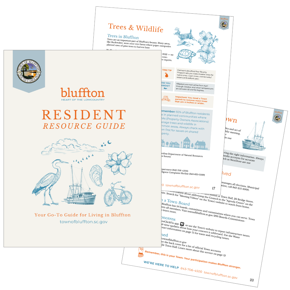
The town where Brightstocking is based, Bluffton SC, has seen explosive growth over the last decade. With so many new residents moving in, Town Management felt Blufftonians needed accurate and transparent information about the Town's resources and services.
The project evolved far beyond our initial expectations, starting at 12 pages, but quickly expanding to 24.
Ashley was tasked with writing the copy, relying on her local involvement and background in elections, real estate, and communications to translate complex topics into easy-to-digest content.
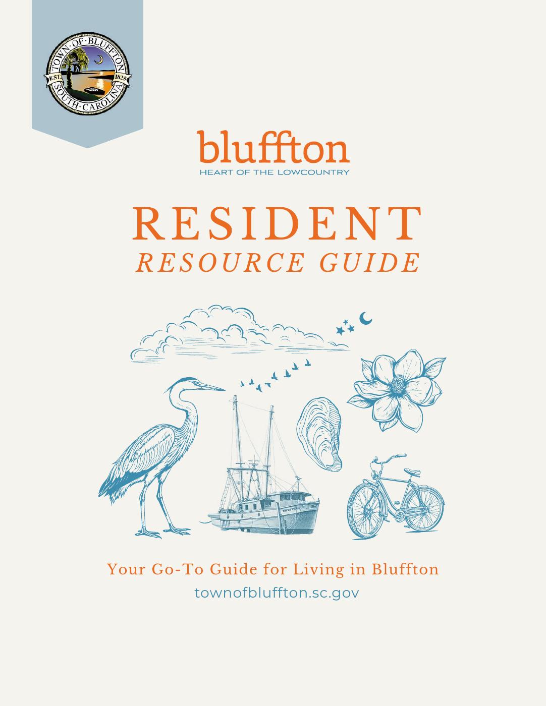
Beegee was tasked with designing a visually appealing, modern guide that adhered to the Town's brand standards.
Side note: A shout-out to A to Z Marketing for their willingness to collaborate on this project!
What we did
-
We started by meeting with the town's Communication Staff to find out what questions Town Hall is most often asked. New families moving in have different questions than longtime residents.
Next, we dug into what's already out there – existing websites, brochures, and any previous guides. This helped us spot what's working well and what might be missing or outdated.
Finally, we spent time honing in on what makes Bluffton special – its history, personality, and the things residents love. This ensures the guide is truly local.
-
Creating the Town of Bluffton Resident Resource Guide was a collaborative process. Municipal departments provided previously published materials so we could accurately craft a comprehensive guide that was easy to read and understand. The content underwent thorough fact-checking with department heads verifying contact information, procedures, and policies. Town executive staff provided feedback and suggestions. Multiple editing rounds ensure clarity and consistency, and compliance with current regulations. This comprehensive vetting process, though time-intensive, produces a reliable resource residents can trust for accurate community information.
-
This guide contains critical information, requiring careful attention to readability and navigation. We incorporated the Town's established brand identity through their existing color palette while maintaining a clean, streamlined approach. The design deliberately omits photography and minimizes iconography. We selected vintage-style illustrations that reflect the Town's historical character, supplementing with AI-generated content only where essential. The primary focus remained on strategic information organization and presentation.

WHY WE LOVED THIS PROJECT
Working closely with city officials and community leaders, we uncovered fascinating layers of local history, discovered hidden resources we never knew existed (the Map Gallery is amazing!), and gained invaluable insights into the inner workings of municipal government. Even as established residents, we found ourselves constantly surprised by how much we were learning about our own backyard!


